Saturday, 27 April 2019

Documentary Week 8 - More Backgrounds and Fonts

This week I made more partially completed backgrounds for my teams to use.

I learned that ropes were more difficult to pull off than I gave it credit for and ended up using a few reference pictures to get the right look for the boat background:


It ended up looking something like this with the guides:


Everyone I asked about the green bananas (although a common sight on Bangladeshi boats) didn't necessarily recognise them as bananas at all, something I'll need to fix with a bit of artistic licensing.

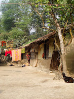
The other partially completed background was for the sneaking out scene. I used a mud house as the main reference:


This is how it turned out:


I'm a fan of the goat and the little pots. And now, everyone now has a background to work with for their scenes.


I also searched out and tested some fonts and everyone was of the agreement that the 6th option was the most readable. We now have the font for our fact cards.


What I learned:
  • Artistic licensing is good
  • Ropes are hard


What went well:
  • Composition of everything in the boat scene
  • Ropes in the boat scene
  • The addition of the goat and the pots in mud house scene
  • Picking the third party 'Daniel' font for the fact cards


What could be improved:

  • Making the bananas yellow and refining them so they're more recognisable
  • Adding a background wall to the boat scene to make it clear that the scene is taking place in a boat
  • Adding more texture to the roof of the mud house.

Friday, 19 April 2019

Documentary Week 7 - Starting the backgrounds

I have been having a hard time starting these backgrounds and I've been scrapping and restarting them a lot. My main focus is to finish the backgrounds my team needs first in case I have to drop the project and run for personal reasons, but after a few tries at the village close up background I ended up starting with the simpler river background to get a feel of the style I'm trying to achieve.

The visual for this background is based on a "huge sailing boat" that was mentioned in another part of the interview (that we opted not to use the audio for but just the visual to mix it up). I ended up asking Arin (the daughter of the interviewee) about it and she sent me a picture of what it would've looked like (as they're not common anymore and I'd never seen one in person) so I knew what to look for. My reference pictures consisted of both paintings and actual pictures:


The river background with the boat guide looks like so:


Now that I had a style down I started on the village close up background. These were the references:


And this is how it looks with a rough guide of the villager crowd:


I ended up redrawing the hut about three times and I was not as happy with how it generally turned out so asked my team if they had any suggestions. In the meantime I've uploaded this to the drive for El to use as a guideline for her scene and I'll improve on it later when everyone has their rough backgrounds.

What I learned:
  • How to simulate a watercolour painting in Photoshop by using a mixture of watercolour and smudge brushes
  • The usefulness of using both watercolour and real life references to help with the backgrounds

What worked well:
  • The general washy style of the river background
  • Simplicity of river background
  • The trees, hut and hay of the village close up background
  • The general blending of the colours in both backgrounds

What could be improved:
  • More trees in the village close up to add more interest
  • Possibly extra grass/ground details in the village close up background

Tuesday, 16 April 2019

Possible change in leader dynamics

Due to some issues I'm having at home, I've assigned Damo and Petra, from the competition and documentary teams respectively, as my second in commands in my groups. They have kindly agreed to step up and help out if needed.


Saturday, 13 April 2019

Documentary Week 6 - Animating the Flag

I tried to test out the paint splatter method I found on an attempted background but I scrapped the background on account of not liking how it looked. I did manage to make a few assets that were a mix and match of third party and Photoshop brushes and try out the effect on an ending title card for the animation using the Bangladeshi flag.

The current Bangladeshi flag - the green represents the field and the red represents the sun as well as the blood of the people who died for its independence, which seems appropriate for the documentary

An image I found some time back that I used as inspiration for the animation test

The first flag of Bangladesh had a yellow silhouette of the country and I thought I'd use these colours for the paint smear that would reveal the title

The end title card test looks like this:


The title might change and I think I'll search for a more suitable font, but I generally like how the effect looks.

In the meantime, El finished the storyboards and animatic and we split all the scenes between us. As El and Petra were interested in doing some of the 'fact cards', I made a fresh set of white animated assets in a separate After Effects file that they can use to keep the animation consistent and made a reference sheet on how to edit the assets when they're placing them in the animation.

My cheat sheet for the team to reference when making the fact card scenes

We are now ready to start production and I'll be doing the backgrounds at the same time.

Friday, 5 April 2019

Documentary Week 5 - Testing the Animation Technique

We decided near the start of the project to go with a sort of illustrative painting that paints itself up kind of style of the animation, but I had been doing the tests on Photoshop by making a new layer every time I make a stroke and then creating a key frame animation. Petra tried this and was concerned about the fact that it meant there would be over a hundred layers in a file and not much leniency for alteration. We sat down and googled if there was an easier way to achieve this and found an After Effects tutorial that could simulate it without needing to make so many layers.


This is a test using the After Effects method we found

I later found an even more impressive After Effects tutorial that would allow a paint stain/splatter effect but lacking the Photoshop brushes I needed to create the assets, I started experimenting with some third party brushes. Dotty blew my mind by sharing some of her watercolour brushes with me that can actually be found on the Adobe website so I spent the rest of the day trying out every brush and noting down the favourites.

I was also concerned if we would be marked down for doing what essentially felt like limited animation but Dotty assured us it would be fine if it fits the style of the documentary, which it does.

Sleep Paralysis and You - Final Version

This is the final version of Sleep Paralysis and You after Prathik has composited in all our parts. It's been a long few months an...